18.10.13

Steelcase Headquarters


I had the opportunity last month to be a guest on Steelcase's private trip to their headquarters in Michigan.

The trip provided an incredible exposure to the furniture market. I walked away with such a better understanding and a refreshed vision of the popular company- Steelcase.

I was fascinated by the thought processes and willingness to experiment in their work. Steelcase is such a leader, in my eyes, to how a company can do amazing things when they think about things more with innovation.

TRANSPORTATION: 
Steelcase has two private jets and eight pilots so they're able to take these trips daily

The Group. Of the group Perkins + Wills, tvsdesign, Cooper Cary, Veenendaalcave, Idea Span, Stanley Beaman and Sears were represented.
 FRANK LLYOD WRIGHT'S MEYER MAY HOUSE: 
Frank Llyod Wright's Meyer May house.
A guided tour that includes beverages, snacks, and a dinner for our group.

Focusing on the horizontal


Interior of Family Rooms

Light Switches


STEELCASE HEADQUARTERS in GRAND RAPIDS, MICHIGAN: 


Breakfast at Steelcase


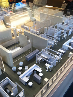
Collaboration Space: furniture that encourages group work

Unique approach to guest seats at an executive desk


Campfire

This looks like workout equipment. It's in fact an innovative piece of furniture, that when asked "how do you use this?" it was encouraged to just walk up to it and use it however you saw. 

Great use of stairway.

Steelcase does extensive research on body posture and gestures. Very interesting!


Love this.


Cafeteria Space

Outdoor Seating. Interest note: alongside the wood panels every couple of feet is a junction box. Steelcase wanted to make sure if you needed to plugin, you could.


Web Conferencing

Lunch! 


Medical Waiting Area Furniture/Geriatric 


GETTING HOME: 

Great trip! 

17.10.13

Good Deeds.


I love seeing people acting to change the lives of others. Cheers to Good Deeds. 


This is Emergency Physicians International.

EPI is a 501c3 team providing emergency medical care in Haiti. I had the pleasure of being apart of their team when I volunteered my design services to help promote their work.

This brochure was designed in 2010, expanding on a template from Pages. The information, layout, and presentation was designed to give exposure, explain, and raise funds for future EPI efforts.


5.3.13

Ice Graces the South in Style

Czar Ice Bar: Atlanta


I love good design. I love design that really gets me excited both functionally and aesthetically. Fortunately for me living in Atlanta, that happens often. I become excited by small things, big things, whole things, half things. It's quite fun.

Most recently though- I had the lovely chance to frequent the Czar Ice Bar here in Buckhead. When I heard there a new spot that had Ice Bars + Vodka + Sushi I couldn't stay away, what girl could?


There were fun suggestions towards Czar imagery on the walls, and a bar covered in ice, digital projections on one wall, and an ambiance that suggested I drink a Vodka on the rocks. Their selection of Vodkas had something for everyone, and since I never (and I mean never) drink any liquor on the rocks, something about the ambiance suggested I break the comfort zone a bit.


I enjoyed watching our bartender climb up the sliding ladders to retrieve certain bottles. I also enjoyed (anywhere I go) when the Chef comes to greet and suggest certain menu items. I love to see a face to a masterpiece anywhere I go. For him, the food was his design- so hell, take pride! And as I sat leaning against the large slab of ice, I thought- Japanese Sushi and Russian Vodka... What an interesting combination.


Skeletal Craze: The Once Scary Fashion Statement


I have been noticing more and more that skulls are making a come back. I am perfectly A-OK with that because I personally love them. My love of skulls started when I grew up in Texas. There is a celebration November 1, the day after Halloween for the modern American, for the Mexican culture. Growing up in San Antonio I was heavily exposed to these festivities. Now, an Atlanta native, I can't help but still be drawn to the faces that once stole my interest.


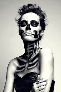
I find that this draw towards the anatomical skeleton is not just me.I find that the fascination and attraction has trickled into fashion, advertising, and the closets of many men and women this 2013. 


What I find to be most interesting, is that at one point in time skulls had a bad connotation to them. They were not glittered and blinged as they are now. I remember thinking that skulls and cross bones were the warning labels on poison, but now Iconic imagery has slithered its way into pop culture. How does this happen? What is it that happens that trends one thing over another. This trend setting has definitely piqued my interest as to why we are drawn to what we are. Is it really a handful of people that get together and decide what trends are set for the following seasons? Is it decided for us before we can even formulate an opinon. I do wonder. 


I understand at some level there is a relate-ability to them. Simply so, we are made of bones. Trends grab to those things that are popular, and I can agree that the eery but familiar topic of bones are scary but oh so cool.


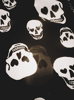
Even on this print- the designer took something and made it warm and fuzzy (almost) with the eyes as hearts and the flowing, transparent, materials used. I think that's my draw, a bit. Taking something that historically has been rebellious, or taboo, or for bikers and not fashionistas necessarily, and making it overly approachable and playful and relatable. 

All i can say is, Kudos.