TABLE OF CONTENTS:
(subjects discussed + analyzed)
PLEASE READ THE CONTENTS TO FIND SPECIFIC SUBJECTS OF INTEREST
CHAPTER 1:
-Point
-Line
-Plane
-Volume
Chapter 2:
-Additive Forms (Grid Form, Centralized Form, Radial Form, Linear Form)
-Primary Solids
-Dimensional Transformation
-Subtractive Forms
-Formal Collision of Geometry
Chapter 3:
-The Unity of Opposites
-Defining space within horizontal linear elements
-elevated base plane
-elevated base plane
-depressed base plane
-over-head plane
-Defining space within vertical linear elements
-single vertical plane,
-L-shaped plane,
-parallel planes, &
-U-shaped planes
-Qualities of Architectural Space
-Form
-Proportion
-Scale
-Texture
-Light
-Sound
-Surface Edge
-Dimension
-Configuration
-Openings
Chapter 4:
-Spatial Relationships
-Space within a space
- Interlocking Spaces
- Adjacent Spaces
-Spatial Organizations
-Central Organization
- Linear Organization
- Clustered Organization
- Grid Organization
- Radial Organization
Chapter 5:
-Building Approach
- Building Entrances
-Configuration of the Path
-Path-Space Relationships
-Form of the Circulation Space
Chapter 6:
-Golden Section
-The Classical Orders (Doric, Ionic, Corinth)
-Renaissance Theories
-The Modular
-The “Ken”
-Anthropometry
-Scale
Chapter 7:
-Axis
-Symmetry
-Hierarchy
-Rhythm
-Repetition
-Transformation
(subjects discussed + analyzed)
PLEASE READ THE CONTENTS TO FIND SPECIFIC SUBJECTS OF INTEREST
CHAPTER 1:
-Line
-Plane
-Volume
Chapter 2:
-Additive Forms (Grid Form, Centralized Form, Radial Form, Linear Form)
-Primary Solids
-Dimensional Transformation
-Formal Collision of Geometry
-The Unity of Opposites
-Defining space within horizontal linear elements
-elevated base plane
-elevated base plane
-depressed base plane
-over-head plane
-single vertical plane,
-L-shaped plane,
-parallel planes, &
-U-shaped planes
-Form
-Proportion
-Scale
-Texture
-Light
-Surface Edge
-Dimension
-Configuration
-Openings
-Spatial Relationships
-Space within a space
- Interlocking Spaces
- Adjacent Spaces
-Spatial Organizations
- Linear Organization
- Clustered Organization
- Grid Organization
- Radial Organization
-Building Approach
- Building Entrances
-Configuration of the Path
-Path-Space Relationships
-Form of the Circulation Space
-Golden Section
-The Classical Orders (Doric, Ionic, Corinth)
-Renaissance Theories
-The Modular
-The “Ken”
-Axis
-Hierarchy
-Rhythm
-Repetition
-Transformation
CHAPTER 1:
POINT me in the right direction >


Points are defined by their coordinates, typically in an X,Y format. This will specify where two lines meet, and thus creating an exact point. They can be used in interior design to create a focus for a space. In the room shown in the photograph above, there is a direct point where the room focuses (between the two blue pillows that rest on the sofa). The table behind the seating hosts both books and the focus for this photograph.

 Line me UP!
Lines are extended points. Typically lines specify both a direction and a length to its extension.
For instance: ____________ & ___
are both lines even in their variation of dominant length.
Lines can become unique to their project. In interior design, the focus resides in what the line accentuates, forms, or leads to. They can assist in the creation of both 2D & 3D forms. Patterns become possible with the use of lines as well. In varying thickness and direction, lines can morph into curves that freely move, or restricted more static forms that mirror a more geometric path.
 In this photograph of the master bathroom, the over sized mirror serves as a frame for the double sinks and marble counter-tops. The already beautiful interior becomes accentuated with the use of the contrasting espresso color used in the mirror against the clean, soft color palette used for this bathroom. This emphasis is possible with the direct use of harsh lines to create a border for such a delicate space.

PLAIN JANE
For instance: ____________ & ___
are both lines even in their variation of dominant length.
Lines can become unique to their project. In interior design, the focus resides in what the line accentuates, forms, or leads to. They can assist in the creation of both 2D & 3D forms. Patterns become possible with the use of lines as well. In varying thickness and direction, lines can morph into curves that freely move, or restricted more static forms that mirror a more geometric path.
 In this photograph of the master bathroom, the over sized mirror serves as a frame for the double sinks and marble counter-tops. The already beautiful interior becomes accentuated with the use of the contrasting espresso color used in the mirror against the clean, soft color palette used for this bathroom. This emphasis is possible with the direct use of harsh lines to create a border for such a delicate space.
PLAIN JANE
Planes are effected by the shapes that surround them.


vA-vA Voluminous!
The amount of space that the object occupies determines the size, or volume.


Here's another great picture of volume- Look at these chairs!

PIC: http://trendland.net/category/architecture-design/interior-design-architecture/page/7/
CHAPTER 2:
-->
Additive Forms----
 merge with other forms either by attaching permanently or latching on for a temporary ride. Linear forms are like kids lining up for school. The additive forms combine in a line, one after the other.
This is a house by Richard Meier. This house looks like it has geometric forms added to it's structure. The openings for the patio are a subtraction to the structure, but the block extrudes past the exterior walls creating additional mass.
Here are some illustrations of these four additive forms:::::::
Grid Form----


Centralized Form----


Using Dubai as an example, a centralized form centers around... err... the center. It's as if gravity is pulling everything to center around one specific area. This formation has been made from the constant addition to sand to it's shore, creating this large ex.
Radial Form-----


They are like bursts of sunshine. They extend outward from a point in a radial way- out and beyond! These forms extend outward from a central form like this mirror.
Linear Form----


Like I mention ed earlier, linear forms arrange sequentially in a row. Think of a chronological line, like these stairs are cascading down in a line, and the building with dots has two horizontal buildings perpendicular to one another.

Primary Solids----


Primary solids are our most recognizable geometric shapes, the circle, the triangle, and the square. These solids move into a third-dimension and become a sphere, pyramid, and cube.

Dimensional Transformation----
The cube can be melted, molded, changed, transfixed, morphed, and pushed into so many different shapes. This quality to be shaped into a thin wide block, or a long thin block, or a long thin block, or maintain a cube is referred to as dimensional transformation. These alterations to its h-w-l still allow the cube to remain a member of a particular family of forms Lucky for the cube, he gets to have his cake and eat it too. Here we see with the picture a visual example of a square, that as a primary solid has a third dimension as a cube, that cube with dimensional transformation can stretch and turn into the shape seen in front of the picture, the blue bathroom case.
Subtractive Forms----


When something is subtracted from something else, it always means something is taken away, or removed. Subtractive forms are just that, forms that have had portions removed from its form. Luckily, as long as the edges of a shape are intact the form will keep its identity. Because geometry is so recognizable, these basic shapes (square, circle, triangle, etc.) are often used in the subtractive method. Here is an example of subtractive forms in art, specifically structure. To do subtractive sculpture, you begin with a block of material, and you take off the material, like chiseling. Here is the work of Michelangelo, a well known subtractive sculpture.


Formal Collision of Geometry----
When a circle and square cross paths they have a few options.. The two can become one,they can become attachments of one another, or one of the two forms will surrender and the dominant shape will envelop the other form within its volume. Now, a square and a circle is just an example. This predicament occurs anytime differing geometric shapes come into intimate contact. This is a good example of how design can mesh geometric shapes to make patterns. We see triangles and what looks to be squares, but the collision has taken place!

CHAPTER 3:
Form and Space: The Unity of Opposites

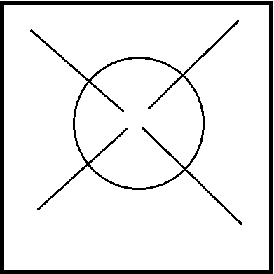
To better understand forms and the areas that surround them, it's easy to organize them into different groups- positive and negative. This visual stimulus engages us to look into both opposites and how they interact. Sometimes the positive and negative relationships are so close it's as though you can see two pictures in the same image.
 Below is an optical illusion to demonstrate this idea.
Here is as well a a good visual example of how the presence, or absence, of space can alter the space's view.
Equally as visually unique is this room painted in all black. Shadows play a large role in our perception of positive and negative space, a and here, when the room is so dark, it plays an interesting game with how we see the space.


Do I Go
Side→Side?
Defining space within horizontal elements:
There are four different ways to establish space on a horizontal axis. Here are four distinctions, representations, and explanations for the following: base plane, base-elevated plane, depressed base plane, and overhead plane.

 <<<<<<<<<<<<<<
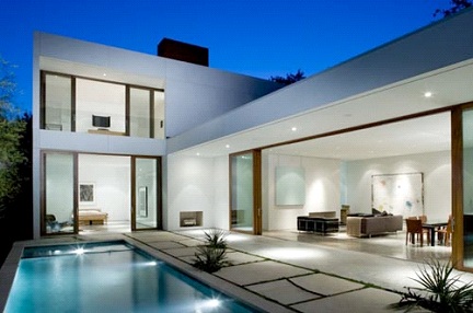
This chase lounge in this picture creates a great horizontal axis for the room. Here are some additional examples using pools as a main concept!


^^^^^^^^^^^^^^^^^^^^^
A base plane is like this slip and slide. It is a flat basic plane that lies and defines a very simple area of space.
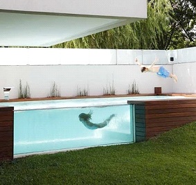
An elevated base plane is like this awesome pool. It is located above ground and defines a space between itself and the ground plane.


This is an example of a depressed base plane, where the horizontal axis sinks into the ground creating a flush look on the surface and housing all its volume below the surface.


An over-head plane, is the last type. It's a form that encompasses a 3D element- like an over hanging or gazebo. This house has a living nook that establishes the boundaries of width, shape, and height- it really determines the footprint of a space because it has a set 'cage'. Naturally to make a box form like this one, the top will match the bottom.

Or should I Go ↑ & ↓ ?
Defining space within vertical linear elements:
(BELOW)
Vertical elements provide a transition into the exterior from the interior world as well as slashing the boundaries between the interior and exterior worlds. The four most important liner planes are the single vertical plane, the L-shaped plane, parallel planes, & U-shaped planes.This picture below shows a strong vertical emphasis.


Here is an example of the L-shaped plane plan, looking very similar to the two-point perspective drawings rendered in common perspective plans. L-shaped plans corner out in a diagonal direction creating this L shape seen in the drawing below.


Qualities of Architectural Space
There are a number of elements that ought to be factored in when analyzing the space in its entirety. Form, proportion, scale, texture, light, and sound are the main contributing factors. Here we see the major components of surface, edge, dimension, configuration, and openings addressed.
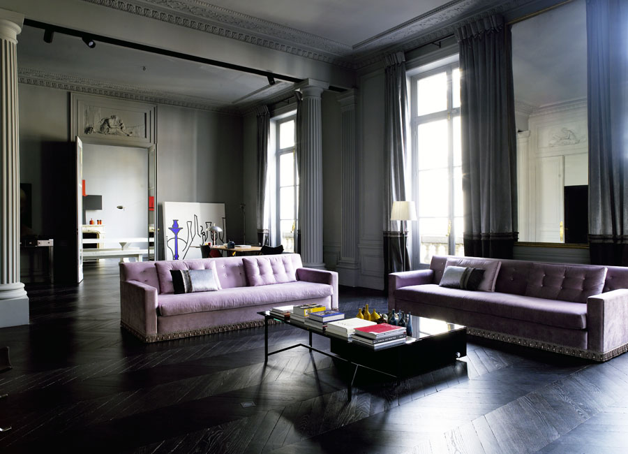


The picture above shows how openings in a space allows for natural light to enter the room and gives the viewers of the interior a view to the exterior surroundings, eliminated the prospect of feeling too enclosed. The room has high ceilings and high windows that are proportionate (good dimensions) to one another, and really makes the sofas used seem smaller than their actual size.
The picture below is a great example of how color can impact a room. With the rest of the room paired nicely with other neutral colors the palette is more interesting with the accented hot pink chair that contrasts the subtle nature of the room.


Openings in space defining elements:
 Openings in spaces are what make the space, end of story. a basic box or geometric form becomes interested only with the subtraction of wall space to create windows or to add continuity within the area. these openings can create the illusion of more space, bring the exterior into the interior with the use of exterior views, and create adjoining spaces by creating relationships. sometimes rooms are bold with the lack of these openings, and the use of them only cause as a distraction from the room.
(LEFT)
Doors are a great example of openings in space, and a commonly recognized element. Here is a great example of just that. They create circulation throughout a space .

The stairs fall into the second story and disappear in the opening seen clearly behind the chandelier. Likewise, the pathway beside the stairs creates circulation throughout the house and utilizes the natural light of the window following.


CHAPTER 4:
Spatial Relationships


A space within a space is when one area is completely consumed by another, it is literally one space in it's entirety enveloped by another larger space. The first picture shows a living space in the foreground that is a separate entity from the house as a whole. The open aired room allows for the inward facing furniture to create the sense of a new space with a new personality different from the space around it. The second picture with the bold red accent wall shows four floor pillows around a low table between two windows. This set up invites the user to experience an alternative setting outside of the public living area.
Interlocking Spaces


Interlocking Spaces are when planes or areas share a common area causing an overlapping of mass amongst both parties. These three pictures are all examples of this idea. The crisp white loft in the first picture shows the different ceiling heights of the loft and the openness that the space creates by having interlocking spaces. The small dormitory room, or small apartment, in the second picture shows the Jenga system of interlocking areas like adjoining puzzles pieces. The spaces serve the space in it's most efficient fashion. The puma store in the picture below uses cargo carriers to create a staggered stack of the structures that show a balanced interlocking system as well.


Adjacent Spaces


Adjacent spaces share a common border. It isn't sharing a space, interlocking spaces, but instead just lines the edge of a different space. These rooms share the divider molding that separates the room with the yellow statue and the room in the rear with the wood armoire.
Spatial Organizations
Centralized Organization


Centralized organizations are when a center point is the main pull for the design of the space. The spaces around the main central focal point gravitates outward from that point creating a central organization of secondary spaces.
Linear Organization


Like the first picture with the underwater dining room, the tables are set in two rows in a single line. The row on the left and right reserve tables neatly filed one behind the other. The second picture has a row of desks with chairs in a straight line. Both of these examples are representations of linear organization.
Clustered Organization

These pictures both share their uniqueness of subject matter. The items in the space do not share a large commonality, but share enough of a visual appeal that they are grouped together in a clustered fashion and it works. Their relationships work in proportion and similarity that produce an aesthetically balanced composition.

Grid Organization

Both of the pictures above and below exemplify grid organization. The picture above shows the cafeteria tables in rows and columns creating a grid like pattern for the room. The space below shows the office spaces in an orderly fashion spaced equally by a consistent unit of measure.


Radial organization is like this picture with the four ottomans centralized in the center of the room. The chandelier creates a focal point for your eyes and is balanced by the furniture that radiates from the center vertical centerline.

CHAPTER 5:
I see my works as quite compatible with a l'art pour l'art philosophy. One may think that I try to take the art object out into the world since my works sometimes appear to have a practical function, but really it's the other way around: things in the world can, under certain special circumstances, enter the realm of art.
--Franz West

The approach to a building is what you see as your walking up to the building and you take your first steps into clear sight of the destination. Like this building here that is overgrown with vines and plants. When you approach this building there is an automatic recognition of the structure's facade. It exudes an earthy feel, drawing largely from nature and what is natural.


Once you've approached the building, the movement through the space from the outside into the interior is referred to as the entrance into a space. This is the entrance to the Chrysler Building. The user would enter through these door to transition into the inside of the structure.


All paths that are taken have an immensely strong process standing behind their final direction. Any path will have either a liner, radial, spiral, grid, network (paths that connect established points in space like a spiral), composite (a combination of a bunch). It is natural for the direction and design of the path to be contingent upon the user and mode of transportation. Here is a good example of a path in network configuration for a pedestrian walkway. The path is define by connecting points.


The relationship between a path and the space that interacts with it can either be a space that is passed by where the path is flexible and the form of the space is kept. It can also be a space that is passed through at a certain angle; almost as if you were to cut through a space. And lastly there is the example we see in the picture above where the path-space relationship can be that the path terminates into a space and the location of the space determines the route of the path (this is popular for religious or symbolically prioritized ceremonies). The stairs in this picture stop at the space at the top of the stairs.


CHAPTER 6:
The desire for symmetry, for balance, for rhythm is one of the most inveterate of human instincts.
-Edith Wharton and Ogden Codman, Jr

The Golden Section is an analysis study that divides the sections of the facade at connection points. The overlay gives an example of how this could be done. The mathematical system plays on proportions to effectively create a sense of balance and repetition among proportionate measurements. "The golden section can be define as the ratio between two sections of a line, or the two dimensions of a plane figure..."

Le Corbusier’s Villa Savoye, Poissy, France

Because the order of the columns varied, the Classical Orders have not been fixed on a unit of measurement but rather to focus on the harmonious balance of proportions.
The Hephaisteion (Athens, Greece) is a great example of this building. The columns in a peristyle have the Doric Order. Starting with the Cornice at the roof, working the eye down towards the linear ribbon, or Frieze, that serves for ornamental purposes as well as connecting all four sides of the building. The architrave is below that, and then there is the top of the column which is called a capital. On the Doric Order they remain simple and somewhat flat. The column itself is referred to as a shaft.


Ionic columns, or shafts, are taller than Doric shafts. This makes columns look slender because of their length. The ridges that run vertically are called flutes, that run from the top to the bottom of the shaft. The bulge you can see, entasis, in the columns is a characteristic that is present to make the verticals appear straight. It's an optical illusion. The capitals on the Ionic Order are ornamental scrolls and the frieze is typically clean and plain.
Below is an example, the Temple of Athena Nike in Athena is one of the most famous Ionic buildings. Located very close to the Parthenon (Doric).

The Corinthian Order is the most decorative of the three Classical Orders. This order uses entasis as well to make the columns appear straighter. The capitals have swirly decorations consisting of flowers and leaves below a small scroll. Unlike the Doric and Ionian capitals (which are slanted) the Corinthian roofs are flat.
The Temple of Sybil in Rome is a good example of this. The Romans used the Corinthian order much more frequently than the Greeks.


The Palazzo Medici Riccardi expresses the spirit of rationality, order, and classicism on human scale that the Renaissance seemed to evoke. This division is emphasized by horizontal planes that divide the building into stories of decreasing height. This makes the building seem lighter and allows the eye to move about freely.


Le Corbusier thought up the Modulor that took from the study of proportions. This incorporated the harmonic measures of the human body, and in 1950 the French architect felt that perfection had been reached. Le Corbusier felt that human life was "comforted" by mathematics. I think this can be seen in his work on flats.


Introduced in the latter half of Japanese's middle ages, the Ken was a proportional system that derived it's measurements from a room's designated number of floor mats. This was soon standardized for residential architecture.
Anthropometrics affect industries that have a duty to human proportions. These include industrial design, clothing design, architecture, furniture, cabinet making and other carpentry, and a number of other professions. It is simply the study of human form- how far we can reach every which way. This chair is a good example of that study, it shows the form of a woman. Intensive thought went into what angle the chair sat at, how high off the ground, where the head rest was, and all of these decisions were made of an anthropometric study.


Scale and proportion are two tricky definitions that require a thorough understanding to differentiate. Proportion refers to the relationship to one another. I could have two massive things, or two small tiny things but they're relationship to one another is what matters. Scale refers to the standard unit of measure and it's relationship to another thing. Human scale is what this house refers to. We can see the car in the parking garage that gives us a feel for how large something is. With proportion you can't always do this because they're in relation to one another, but i can look at this photo and assume measurements based on the scale of that vehicle.


CHAPTER 7:


AXIS
Because an axis relies on a linear quality, looking for a directional component to a space or plan will help in determining. A lot of the time elements will border the edges of a line to create the axis. This Paris apartment has a rooftop terrace that creates symmetry with it's vertical axis. The walls help confine the space and direct the axis down the center-line on the table vertically. The overlay and diagram represent this theory.

Symmetry
Our eyes look for balance and symmetry in our everyday happenings. It gives our eyes a 'break' from the irregularity that can be disrupting. The bold yellow front door has two windows on either side of it to allow natural light into the interior and for the residents to have vision of who's approaching the house. The centered floor mat and pots on either side of the door add to the facade's symmetry. Equally balanced and adding a textural component is the mirror on the right. With whimsical ornament, the mirror creates an interesting balance on both sides of the frame.


Hierarchy
Hierarchy is most commonly recognized by contrasting shape; one element possessing inconsistency in size to the rest of the space. This large bed and bed frame serve to dominate the space, creating hierarchy of importance for this bedroom. The other elements such a wall decoration, secondary furniture pieces, and fireplaces become second to the major focus- the bed because it's so large in size in comparison to its surroundings.


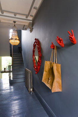
Datum
Datum refers to the relationship shared between elements on a common axis, plane, or voluminous boundary. This hallway serves to create a volume that collects the pattern of the coffered ceiling within its boundaries as well as organizing the chairs and picture frames linearly along its border. This axis down the centerline of the hallway is representative of datum both in plane, volume, and line.


Rhythm + Repetition
Rhythm & repetition are commonly used to create excitement visually. Architecturally, beams and columns are commonly used in repetition to create a sense of rhythm and commonality. We see an example of this in the first picture. The light breaks through the slits in the outdoor cantilever. The columns create a linear repetition that mirror the punctured openings on the left hand side that allow light, air, and view to people in the interior. The second picture, with the kitchen, uses the repetition of the backsplash to create movement in the space. The horizontal wave creates a pattern that creates repetition with the recurring element.


Transformation
As designers, we manipulate our designs in order to come to the best possible solution. This is what transformation roots it's practices in. Transformation is the manipulation of specific elements over and again, trying different approaches in order to produce the best outcome. This can be a snowflake, where the edges are skewed, then the size is altered, then the rotation, the pattern, etc. It might look like a snowflake at first, and then the edges are geometric and sharp, then an angle is repeated throughout, maybe reduction takes place and a limb is removed. Whatever the process, transformation can be fun because it's the manipulation of trial and error. In this beautiful residence, geometric form was copied, multiplied, and then distorted. The square was stretched, smoothed, subtraction was used, voids were creating. The diagrammatic drawing shows this visually.